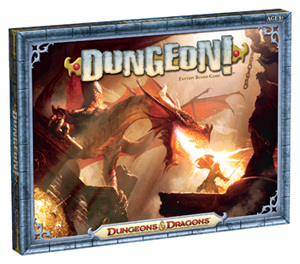
Image From The WotC Website

Welcome to our first Rulebook Review! As you can see from the pretty picture, we'll be reviewing Dungeon! Dungeon was originally published in 1975 by TSR Inc. The idea was a simple dungeon crawl where you choose a character, kill monsters, get treasure, and be the first to escape alive with enough treasure. Now published by Wizards of the Coast, it got itself a nice reprint with updated art in 2012. You can check out the game on their website or see it's entry on BoardGameGeek for more info.
There is a good reason that this game gets our first review. The fifth edition is supposed to be coming out this year, June 17th to be exact and it's a good time to give the rules a look to make sure they are strong in the reprint!
Remember, we ONLY review the rulebook, the game could be good, bad, or somewhere in between but that's for you to decide. If the game sounds interesting to you after this you have the information above to check it out!
For those not interested in hard analysis of each page, here's a quick summary: The rulebook definitely feels like old DnD like the game's roots, and it does so it the worst way. Nostalgia for such days aside the rulebook is larger then it needs, overly complex, and has lots of “turn to this page” for organization with an old style Table of Contents with Appendixes and all. Plus the rulebook isn't in booklet form, you have to unfold and refold pages or else it takes up a huge expanse of table space.
For a game that is “A Fantastic Game Adventure for the Whole Family!” (from the back of the box) and claims to feature "simple, straightforward rules that are easy to learn" (from the website) the rulebook doesn't fit that and is in direct conflict with the market it's intended for.
Susan's Rating: One Curl Down
Susan's Explanation: While the rules are not too bad to read, they still seriously miss the mark for the game intended. You will be able to read through these and play the game but reading them will still be a unnecessary pain with its clumsy design. It's definitely not good for Age 8+ as the box says.
Now for those who want to really dig into the game and learn something about rulebook design keep reading. This is quite the explanation, so sit down and get ready to read!
If you'd like to follow along, you can check out a PDF version of the rules here. I'll be going page by page so it wont be hard to do. Plus the PDF is a scan of what their rules look like folded out which in this particular circumstance will add a lot to the review for you!
This one has something you don't see very often in rulebooks, the credits are on the front page! Right under that is the contact info to contact Wizards of the Coast as well. While this is unusual, it doesn't get in the way of the important part of the page, a table of contents.
The table is set to the left which is smart: the rules being in English people will most likely be reading from left to right so you want important information where their eyes are going to be. Since they have the credits and contacts to the left they aren't distracting while using their space productively, a smart start!
But here is where things get a bit tricky. The game isn't in a standard booklet form, it unfolds so when looking for pages you see Front, Back-2, Back-4, and so on. It's not that confusing, but it tells me off the bat that there is going to be annoying flipping and folding of the rulebook to find what I need if I need to double check a rule. Heck, it'll be take up a ton of space while just going through it the first time.
After that is a standard game components list, then a How to Win section. This is the standard overview off the game while showing a little graph to show how much gold you need to win. All good stuff.
So then we'll go to page... er... front. “Front” consists of 3 pages folded out and has a LOT of information . The first two parts have a nice picture of the board and shows where all the parts go. This is all standard and good, the graphics look nice as well but the kicker is you get too much information thrown at your face that you don't need yet that just makes things confusing.
Now if you stick to the left hand side of the rulebook you can still get through and take in what you need as you need it. Unfortunately since “Front” is a whole page and there is a lot to draw you into and all of the graphics look very important. When you are setting up pieces even though the rules say “as described here” which is supposed to lead you down to the Heroes section below, you see that huge picture of the board and a picture says a thousand words. Most people looking on how to setup in a rulebook are going to look at the picture WAY before any text explanation.
Now the worst could happen and after someone follows the pictures and ignores the random explanations hope the rest of the rulebook covers it flips it over and starts looking at “Back-1”. And will be missing picking a character, choosing who goes first, how fighting monsters works, and a ton more.
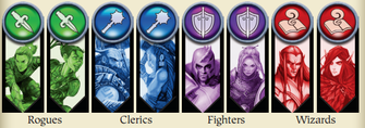
But we're going to try to use the rules as intended. So we go to the section called Heroes. It tells you to select a hero, shows you how to construct the pieces (a nice graphic but yet again draws you away from the instructions towards the middle with the pictures) and then there's a big mistake. It says to roll to see who goes first, and says that player gets the first choice of hero. But it already told me to pick a hero! Okay trying to be fair, it does this in a manner that is grammatically correct and still has flow with how it is written, it is saying what you will do before it explains how you do it. But even though it is technically correct it's still BAD. There is no reason to write that way, doing it correctly wouldn't cut into the flow of the next section either that explains what makes each hero different and why you would want to pick each hero.
This one has something you don't see very often in rulebooks, the credits are on the front page! Right under that is the contact info to contact Wizards of the Coast as well. While this is unusual, it doesn't get in the way of the important part of the page, a table of contents.
The table is set to the left which is smart: the rules being in English people will most likely be reading from left to right so you want important information where their eyes are going to be. Since they have the credits and contacts to the left they aren't distracting while using their space productively, a smart start!
But here is where things get a bit tricky. The game isn't in a standard booklet form, it unfolds so when looking for pages you see Front, Back-2, Back-4, and so on. It's not that confusing, but it tells me off the bat that there is going to be annoying flipping and folding of the rulebook to find what I need if I need to double check a rule. Heck, it'll be take up a ton of space while just going through it the first time.
After that is a standard game components list, then a How to Win section. This is the standard overview off the game while showing a little graph to show how much gold you need to win. All good stuff.
So then we'll go to page... er... front. “Front” consists of 3 pages folded out and has a LOT of information . The first two parts have a nice picture of the board and shows where all the parts go. This is all standard and good, the graphics look nice as well but the kicker is you get too much information thrown at your face that you don't need yet that just makes things confusing.
Now if you stick to the left hand side of the rulebook you can still get through and take in what you need as you need it. Unfortunately since “Front” is a whole page and there is a lot to draw you into and all of the graphics look very important. When you are setting up pieces even though the rules say “as described here” which is supposed to lead you down to the Heroes section below, you see that huge picture of the board and a picture says a thousand words. Most people looking on how to setup in a rulebook are going to look at the picture WAY before any text explanation.
Now the worst could happen and after someone follows the pictures and ignores the random explanations hope the rest of the rulebook covers it flips it over and starts looking at “Back-1”. And will be missing picking a character, choosing who goes first, how fighting monsters works, and a ton more.
But we're going to try to use the rules as intended. So we go to the section called Heroes. It tells you to select a hero, shows you how to construct the pieces (a nice graphic but yet again draws you away from the instructions towards the middle with the pictures) and then there's a big mistake. It says to roll to see who goes first, and says that player gets the first choice of hero. But it already told me to pick a hero! Okay trying to be fair, it does this in a manner that is grammatically correct and still has flow with how it is written, it is saying what you will do before it explains how you do it. But even though it is technically correct it's still BAD. There is no reason to write that way, doing it correctly wouldn't cut into the flow of the next section either that explains what makes each hero different and why you would want to pick each hero.
Those little explanations also have issues as well, with little sections in parenthesis sending me to other pages to learn about certain parts of the game. Anything that makes or encourages players to flip back and forth is bad, a player is going to look through your rulebook and get to that information at the proper time when they need it, and with this rulebook saying go to Back-1 is going to be even more difficult with all the folding and flipping involved.
Now if we do things right, you'll be moving to what is above the picture of the board which explains the boards and the various chamber with a picture of the board smaller trying to show the sections in more detail. More charts and more data and I'm not actually getting into how to play the game yet, plus it's still explaining setup of the game here too, “Front” seriously lacks flow.
Then we scroll down to tokens. All of the explanations are written well, but it's still telling me lots of things on how the game works, but I'm STILL not moving into gameplay after picking my character and STILL learning about setup. The theory that you are supposed to go in order is slipping.
The last part of “Front” is Cards, it mentions how all the cards work. They are well written again except for those parts telling me to flip in so many pages and I'm still learning setup and still not playing my game. Plus I'm only just learning now that I chose a Wizard that I'll be rolling dice to figure out how many spells I take, that would have been nice to know when I chose the wizard.
 Is This Distracting? My Point Exactly
 Now, let's flip to “Back”And see how this goes. Yep, annoying as expected. But at least I finally get to playing again!
I see a good thing here with Sequence of Play, it shows everything in steps which is really good for how most people read rules today. I'll be able to get through a turn. Then I get to Move step and see parenthesis IN parenthesis... not a good start.
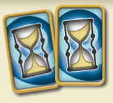
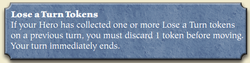
Right in the middle I see a cut about Lose a Turn Tokens, not off to the side it's placed RIGHT there. It may be in a little gray box but there's no way I can skip it for now, it doesn't set itself up to be a sidebar as intended and just plain draws your eyes to it. If you have a lose a turn token, you discard it and lose a turn is the basis. I'll never say it's bad to state the obvious as for some people you should seriously show every detail but it's just placed badly.
At least there is a nice graphic showing movement, pictures are much better then explanations and honestly that section might be better then the entire section before it sadly. With better writing that whole part could have been condensed and simplified to help make picking up the game faster and easier meeting the desired market goals.
We then move onto the Doors section, another good picture and at least this time the explanation is alright it could still use some condensing there as well.
I see a good thing here with Sequence of Play, it shows everything in steps which is really good for how most people read rules today. I'll be able to get through a turn. Then I get to Move step and see parenthesis IN parenthesis... not a good start.
Right in the middle I see a cut about Lose a Turn Tokens, not off to the side it's placed RIGHT there. It may be in a little gray box but there's no way I can skip it for now, it doesn't set itself up to be a sidebar as intended and just plain draws your eyes to it. If you have a lose a turn token, you discard it and lose a turn is the basis. I'll never say it's bad to state the obvious as for some people you should seriously show every detail but it's just placed badly.
At least there is a nice graphic showing movement, pictures are much better then explanations and honestly that section might be better then the entire section before it sadly. With better writing that whole part could have been condensed and simplified to help make picking up the game faster and easier meeting the desired market goals.
We then move onto the Doors section, another good picture and at least this time the explanation is alright it could still use some condensing there as well.
Now to Step 2. Encounter. Redundancy is a major part of the beginning here. An complex explanation followed by a picture that does a WAY better job of explaining. Yet again they could have used the picture to its full potential and made things better.
Now they mention if you find a trap you can see their “sidebar”, a huge chunk right in the middle again. Hey, at least this time they mention you can skip over it if you aren't "fighting" a trap. My huge problem with this section was that AGAIN it could have been condensed. I like the pictures don't get me wrong, but the entire section could be summarized to “If your hero is in a room when a trap is drawn, draw one treasure as if you had defeated a monster, then resolve the effect of the trap.”
I just cut out 3 unnecessary paragraphs AND got rid of a bunch of parenthesis again. Plus it might actually be the size of a sidebar now! Thorough explanations are good, but when the cards themselves explain how to use them in a very simple way there's no need to put a complex explanation in your rulebook. It's the equivalent of a card saying “draw two cards” and having the rulebook say “if a card says to draw two cards, place your hand upon the deck you are drawing from and draw by picking up one card at a time while not revealing it to the other players”. Why do it?
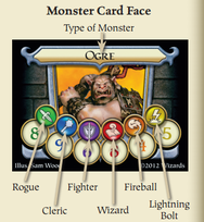
Now to Combat where there are still more problems. That nice graphic of a Monster card on the other side of the rulebook that would be PERFECT here? Nope. Instead I get a wordy explanation. This mistake has been made before in this rulebook and it doesn't look like it will stop, use pictures properly to make your explanations better!
You get a “sidebar” that talks about how to cast spells, this is seriously a good spot for it so I'm okay with it even though it's not an actual sidebar.
Now they mention if you find a trap you can see their “sidebar”, a huge chunk right in the middle again. Hey, at least this time they mention you can skip over it if you aren't "fighting" a trap. My huge problem with this section was that AGAIN it could have been condensed. I like the pictures don't get me wrong, but the entire section could be summarized to “If your hero is in a room when a trap is drawn, draw one treasure as if you had defeated a monster, then resolve the effect of the trap.”
I just cut out 3 unnecessary paragraphs AND got rid of a bunch of parenthesis again. Plus it might actually be the size of a sidebar now! Thorough explanations are good, but when the cards themselves explain how to use them in a very simple way there's no need to put a complex explanation in your rulebook. It's the equivalent of a card saying “draw two cards” and having the rulebook say “if a card says to draw two cards, place your hand upon the deck you are drawing from and draw by picking up one card at a time while not revealing it to the other players”. Why do it?
Now to Combat where there are still more problems. That nice graphic of a Monster card on the other side of the rulebook that would be PERFECT here? Nope. Instead I get a wordy explanation. This mistake has been made before in this rulebook and it doesn't look like it will stop, use pictures properly to make your explanations better!
You get a “sidebar” that talks about how to cast spells, this is seriously a good spot for it so I'm okay with it even though it's not an actual sidebar.
Now for the next mini section B. The Monster Strikes Back. It shows a chart that is already on the board and easy to access to yet again make the rules longer. “If you did not destroy the monster, refer to the Monster Attacks chart on the board.” Other then renaming that section on the board to be better (it's like the rules, complex for no reason when it should be a simple reference) I yet again got rid of a huge paragraph. Follow it up with the useful Dropping Treasure section and it would be good.
Next page, er, fold, er, Back-3.
Step 4. Loot. It's just a quick repeat to make sure you only pick up treasures if you kill a monster in a room. It's redundant, but it's good to see it in the step format and it's short enough to not get in the way if you are trying to just read through your turn.
Then you get a section thoroughly explaining Wizard Spells. This isn't a bad idea but it lacks those pictures on the front again and could have been simplified. It has information you really need like how teleport works and how to regain spells, but I feel like a better written Wizard section when you went to choose the wizard could have covered all of this and been in a more relevant section of the rulebook.
And it's great that this section is thrown in right before the friendly reminder on how to win the game, it just doesn't make sense! At least they had that reminder there, this is one time when repeating isn't bad, having how you win at the beginning and the end of a rulebook is a good thing, you want to reenforce what you are trying to do in the game.
Now... An appendix... Joy. Now this section is really needed as it explains the special treasure cards in detail and I'm glad it's at the end of the book. Trying to force it somewhere in the middle would have just resulted in more unneeded complexity. The explanation is again written poorly. When you look for an explanation your want clear and concise and this really doesn't do that at all.
Finally, Appendix 2: Solo Play. Now this section is done perfectly. I can see they needed to fit it into the last section of the rulebook so they kept things short and kept things clear. If the rest of the rulebook had been written like this it would be much better.
Thanks for reading that page by page analysis! If you agree or disagree on anything I said let me know below! Also, we want to make these reviews good for you so give us comments on how we can make these better for you. If you want to keep up with Rulebook Review, like us on Facebook, follow us on Twitter, or sign up for our email list. Susan and I await your comments!